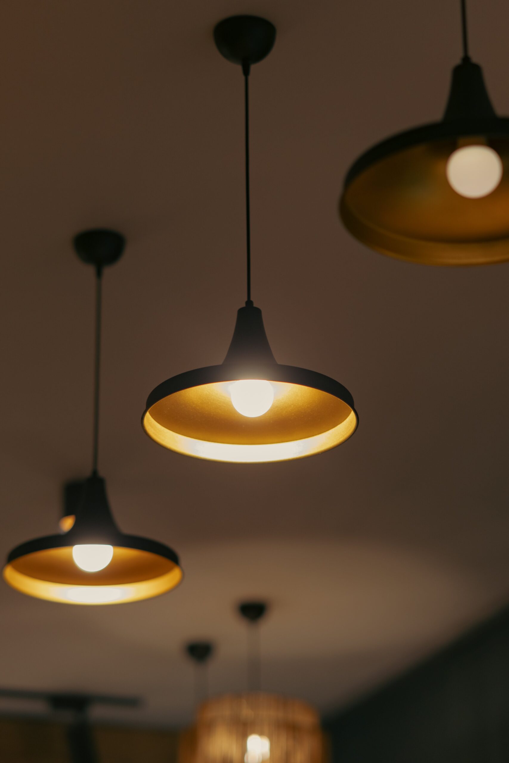
So you want to learn how to make your compositions more visually compelling? Well, one technique you might want to consider is effectively utilizing negative space. Now, you might be wondering, what exactly is negative space? Essentially, it’s the empty space surrounding the main subject of your composition. By purposefully incorporating negative space, you can create balance, draw attention to your focal point, and add depth to your overall piece. In this article, we’ll explore some practical tips and examples to help you master the art of using negative space in your compositions.
Contents
Understanding Negative Space
Negative space is a fundamental concept in art and design. It refers to the empty or unfilled areas surrounding the main subject or focal point in a composition. It is the space between objects, figures, or elements within a design. Negative space is often overlooked, but it plays a crucial role in creating balance, focus, and overall visual impact in a composition.
Definition of Negative Space
Negative space, also known as white space, is the area that surrounds and defines the main subject or elements in a composition. It is the absence of objects or elements, yet it holds equal importance in the overall design. Negative space can be categorized into two types: macro negative space, which refers to the overall empty areas in the composition, and micro negative space, which refers to the white space within individual elements.
Importance of Negative Space
Negative space is of great importance in art and design as it helps create balance, harmony, and contrast in a composition. It provides breathing room for the eye and prevents overcrowding of elements. By strategically using negative space, you can guide the viewer’s attention to specific areas or objects in your composition. It allows the viewer to appreciate the main subject while also giving context and visual interest to the overall design.
Creating Balance and Focus
Balancing Positive and Negative Space
One of the key aspects of using negative space effectively is achieving balance between positive and negative space. Positive space refers to the main subject or elements in a composition, while negative space is the space surrounding it. Balancing these two elements is crucial to avoid overwhelming the viewer or creating a cluttered composition.
By distributing positive and negative space in a balanced way, you can create a sense of harmony and visual stability. This can be achieved by positioning the main subject off-center and allowing more negative space on one side to counterbalance the weight of the subject. A well-balanced composition with equal distribution of positive and negative space has a pleasing and harmonious aesthetic.
Using Negative Space to Create Visual Hierarchy
Negative space can also be used to create visual hierarchy within a composition. By using negative space strategically, you can guide the viewer’s eye and emphasize certain elements or areas in your design. The areas with more negative space will naturally draw more attention, while areas with less negative space will appear more prominent.
Experimenting with different shapes and sizes of negative space within your composition can help you create focal points and direct the viewer’s gaze. Additionally, negative space can be used to separate different elements and establish a clear visual hierarchy, making your composition more visually engaging and impactful.

This image is property of images.pexels.com.
Enhancing Composition and Design
Emphasizing the Subject
Negative space can be used as a powerful tool to emphasize the main subject or focal point in a composition. By strategically surrounding the subject with ample negative space, you draw attention to it and allow it to stand out from the rest of the design. This technique can be particularly effective when working with minimalistic or abstract compositions.
To emphasize the subject using negative space, ensure that the negative space complements the subject and doesn’t distract from it. The negative space should enhance the visual impact of the subject and create a sense of contrast and focus. By doing so, you create a strong visual presence and draw the viewer’s attention directly to the subject.
Creating Depth and Dimension
Negative space can also be used to create the illusion of depth and dimension in a composition. By strategically incorporating negative space, you can give the impression that elements are floating or exist within a three-dimensional space. This technique is especially effective in graphic design, where the use of negative space can add a sense of depth and realism to a flat design.
To create depth and dimension using negative space, consider using overlapping elements and adjusting the size of the negative space between them. By gradually increasing the negative space as objects appear further away, you can create a visual hierarchy and a sense of depth. This technique adds visual interest and complexity to your composition, making it more visually engaging.
Using Negative Space in Typography
Applying Negative Space in Letterforms
Negative space can also be effectively utilized in typography to create visually interesting and legible letterforms. By carefully adjusting the spacing between letters and characters, you can control the negative space within and around the text, enhancing readability and overall visual impact.
Spacing between letters, known as tracking or letter spacing, can be adjusted to create an evenly distributed negative space between each letter. Generous tracking can create an elegant and airy feel, while tight tracking can give a bold and impactful appearance. By experimenting with negative space within letterforms, you can create unique and visually captivating typography designs.
Negative Space in Text Layouts
In addition to letterforms, negative space can also be applied to text layouts to enhance readability and create a balanced composition. Proper use of negative space around paragraphs, headlines, and images can make the text easier to read and visually appealing.
Ensuring adequate spacing between paragraphs and lines of text helps to prevent the text from appearing crowded, allowing readers to navigate through the content effortlessly. Incorporating negative space around images and headlines can draw attention to these elements, making them stand out and capturing the reader’s attention. By using negative space effectively in text layouts, you can create visually pleasing and well-structured compositions.

This image is property of images.pexels.com.
Negative Space in Photography
Using Negative Space for Emphasis
Negative space plays a significant role in photography, allowing photographers to create visually striking and impactful images. By utilizing negative space effectively, photographers can emphasize the main subject or capture a sense of solitude and quietness.
In landscape photography, negative space can be used to highlight the vastness and grandeur of the natural surroundings. Placing the main subject against a backdrop of expansive negative space draws attention to the subject and accentuates its importance within the scene. This technique creates a sense of scale and immensity, providing a visually captivating experience.
Negative Space in Portraits
Negative space can also be utilized in portrait photography to create a sense of intimacy and focus on the subject. By incorporating ample negative space around the subject, photographers can bring the viewer’s attention directly to the person being photographed.
Using negative space in portraits can create a minimalistic and clean aesthetic, allowing the subject’s expression and features to take center stage. The absence of distracting elements in the negative space creates a sense of serenity and intimacy, enabling the viewer to connect with the subject on a deeper level.
In conclusion, understanding and effectively utilizing negative space is essential in art and design. It helps create balance, focus, and visual impact, whether in compositions, typography, or photography. By carefully considering negative space and its relationship with the subject or elements, you can create visually captivating and aesthetically pleasing designs that engage and resonate with the viewer. So, don’t overlook the power of negative space; embrace it and explore the endless possibilities it offers in your artistic endeavors.

