Last month we teamed up with 500px Ambassador, Ryan Longnecker to challenge the 500px community to show us breathtaking images of our planet at scale.
Photographers were asked to submit their best landscape and nature images that use the subject and background to highlight the scale (small or large) of the scene. The results did not disappoint.
A message from Ryan:
Judging this Quest was so hard. There are so many amazing amateur and pro photographers on 500px whose entire portfolios make me want to throw my camera away, and this Quest was a great example of that.
Such amazing combinations of color, framing, scale, texture, depth, and subject. Plus, there was such a great sense of intentionality among the submissions; seeing all of these amazing places captured made me want to get back out there the minute travel is a thing again. I love how there is such variety in the way people approach showing scale in a scene and that they all aren’t all strictly landscapes or nature photos, but some like portraiture, fine art, still life, even abstract.
Great work on all the submissions and keep it going, I’m very inspired by everyone who entered.
First Place Winner
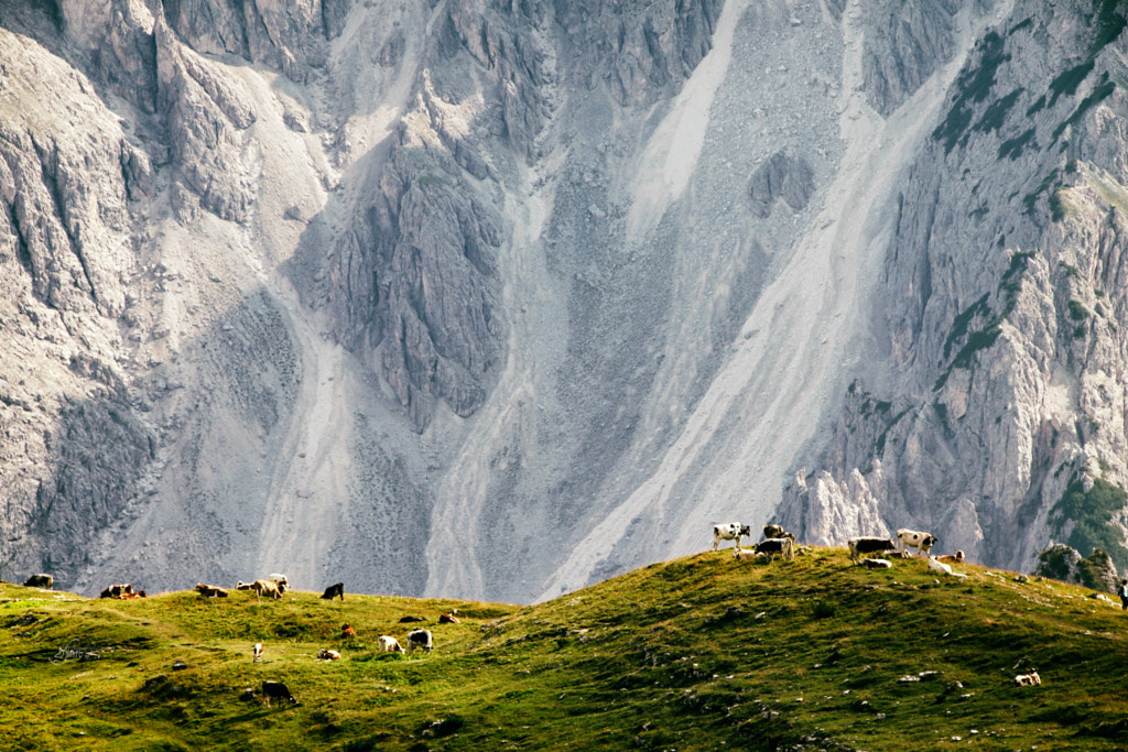
Photo by Daniela Sbarro
This photo uses so many amazing elements. It’s simple, filled with texture, and has the foreground placed very well across a mysteriously large sprawling backdrop of the mountainside. I love the subtle separation and contrast differences, and without a clear mountain top it also evokes wonder about the actual scale. The compression of the image from the telephoto lens is also a very fun way to show scale and takes some intentional planning as you really need to be far away from the subject to make it work. Great job Daniela, I love it.
Runners Up
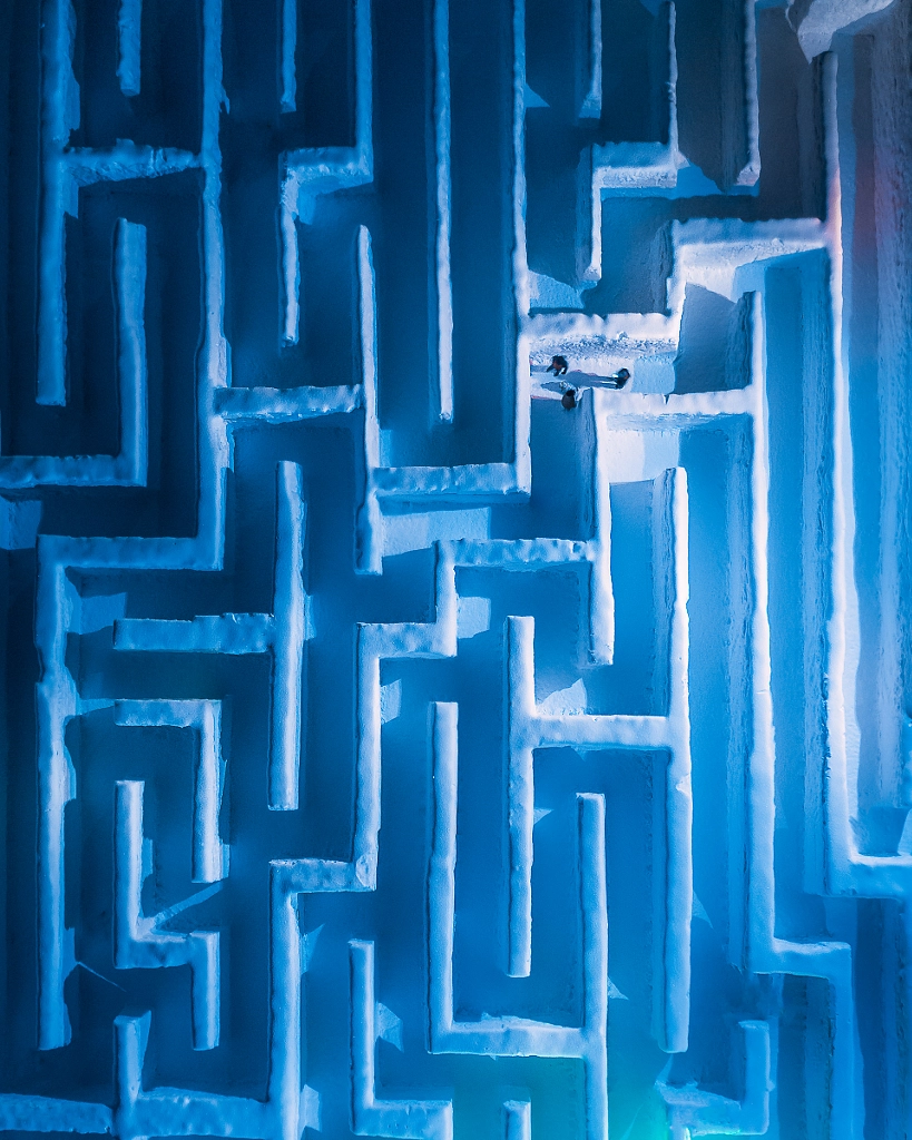
Photo by Grzegorz Tatar
I love seeing something new! The top down dramatic lighting of this snow/ice maze is very cool. And similar to the winner, it evokes a wonder about how big the maze actually is. The slight gradient and light direction also creates a very nice transition of light to dark in the image and the shadow casts further increase the very angular shapes in the frame. I like that there is a great narrative here with just the three people in the maze and no one else. Well done! Using a drone in unique settings is always fun to see.
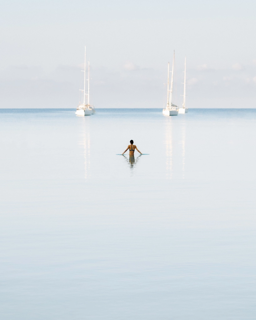
Photo by Dom Piat
There is minimalism and symmetry that really helps this photo feel like a fine art piece. The scale of the water, the subject, and the boats with the very muted clouds in the background set a very gentle scene—the word serene feels appropriate. It may not have the classic small person with a grand mountain backdrop but I think that’s what I like about it. It’s an atypical beach/ocean/water scene and has all the makings of an amazing print.
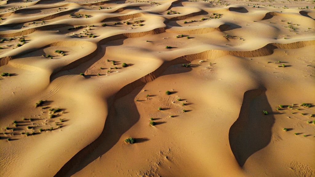
Photo by Salem Alforaih
I am a sucker for textures. This image is almost entirely texture, but then I love how the only hint at the scale is not what you’d expect (I dig that it’s not totally clear). It’s not the trees/bushes, but the small set of tire tracks that wind on the left side of the frame. At first it looks like this could be super far away taken in a helicopter but those tire tracks make you give the image another once over. The shadows and colors are great too and whenever there is a lot of cohesiveness across the frame it makes it easy for small details to stand out.
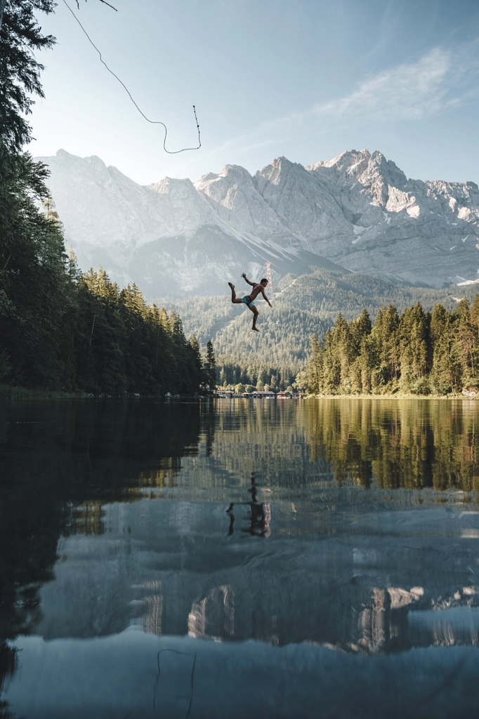
Photo by Anskar Lenzen
Every time I look at this shot it moves up in the ranks; I just love it. I really like how the rope ‘snap’ is caught in the open sky. Obviously it has the ingredients of a very popular kind of shot, subject in front of a mountain with reflection but with the perfectly frozen mid-action, very small amount of trees holding the rope on the left, and with amazing framing and light, this shot really kills. You should do yourself a favor and look at more of Anskar’s work.
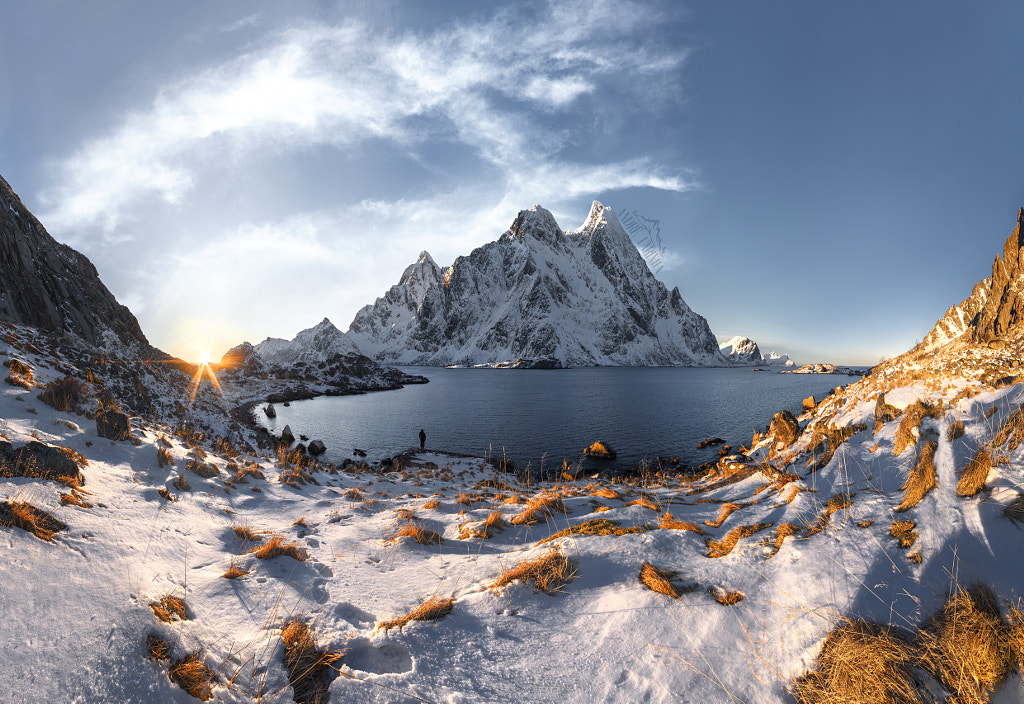
Photo by André Farinha
This panoramic shot of Lofoten has more than just a couple things going for it. The amber and blue color scheme is a favorite of mine, plus the first light over the horizon casting shadows on even the smallest of twigs in the foreground. The depth both between the foreground grass, with the subject in the middle, and the massive mountain backdrop, gives it a few layers to engage the eye with. There is a warmth and coolness both to the color and the scene in itself. If you’ve ever waited for a sunrise in a cold snowy area you know how good that feels. Great work Andre.
If you’d like to see more of Ryan’s work, check out the following:

