“There are no rules for good photographs,” the American landscape photographer Ansel Adams reportedly said. “There are only good photographs.” When it comes to creating a photo that resonates with people, there is no easy formula, but perhaps we can find some clues by analyzing the right images.
We spoke with a handful of 500px Licensing Contributors about some of their most successful pictures to see if we could unlock the secret to making a viral photo. These photographers come from all over the world and cover genres as diverse as cityscapes, landscapes, still lives, and fashion, but they have one thing in common: hugely popular images.
We wondered, what makes these photos stand out amidst the sea of images we consume each and every day? With their help, we’ve taken a stab at cracking the code.
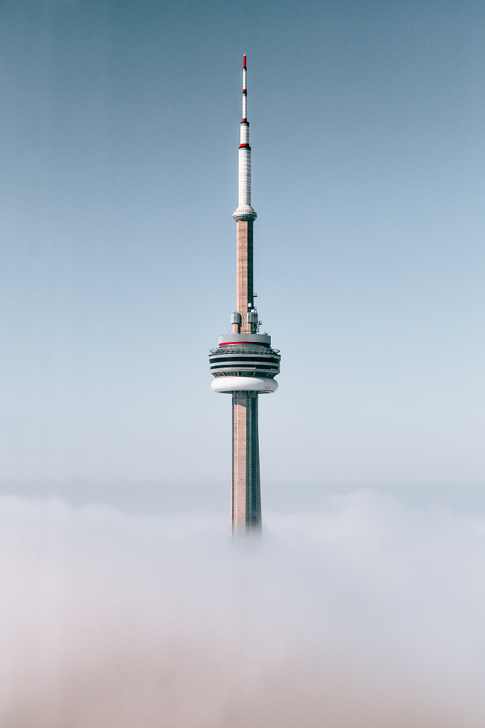
Why it works: This picture, titled In The Clouds, puts a fresh spin on a familiar subject. As of this writing, there are more than 1.2 million photos tagged #CNTower on Instagram. The most recent one was posted less than five minutes ago. The market for photos of famous landmarks like this one is saturated, so most photos of this Toronto tower will end up lost in the shuffle. In The Clouds is an exception.
“I have various photos of Toronto that have been sold or shared frequently because they offer a unique perspective that’s hard to achieve,” the photographer Mitul Shah tells us. “In The Clouds was a case of perfect timing. I was in the right spot at the right time.”
Still, it wasn’t by chance that Mitul captured this image. He created his own luck. At the time, he was working as an intern in the city’s tallest office building. He bided his time, and when the conditions were just right, he seized the opportunity.
“Every day I went into work, I waited for the chance to see the city covered in fog,” he remembers. “When the weather was perfect for what I needed, I ran to the top floor viewing area with my camera. I knew my office offered a view that wasn’t available to many, and, as a cityscape photographer, I had to take advantage of it.”
When it comes to sourcing photos of the CN Tower, designers are spoilt for choice. But they’d be hard-pressed to find an image like this one: an isolated tower, surrounded by blue sky, emerging from the clouds of the city below. It’s not the place itself but the unusual vantage point that makes this picture so valuable.
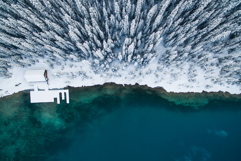
Why it works: As with the last photo, this one takes a well-known place and exceeds our expectations. “This aerial image of Lake Louise has been shared and sold time and time again,” its creator, Aidan Campell, tells us. “I think that it has been popular due to the fact that it is a unique, one-of-a-kind perspective of a recognizable and popular Canadian lake.
“Although the lake is photographed by hundreds of people on a daily basis, this particular angle is now near impossible to capture without a helicopter (it’s no longer legal to fly drones in the park), making this capture particularly special.”
Lake Louise, located in Banff National Park, is famous for the stunning surrounding Canadian Rockies, and designers will have no trouble finding a “typical” vantage point that incorporates those peaks. Aidan’s drone view is more abstract and far less predictable. He’s also managed to include those snow-capped trees and the dock, adding context and nuance to a place we’ve seen a thousand times.
“These days, it’s extremely uncommon to be the first person to photograph a location, concept, action, pose, etc.,” Aidan explains. “Rather than reinventing the wheel, I find the best way to have your image stand out from the crowd is to capture the same scene from a different angle that people haven’t seen before. Be creative and be different.”
As a bonus, Split has a winning composition. “A lot of my more popular images seem to share a sense of minimalism,” Aidan explains. “A busy image can distract the viewer from the subject or the message, whereas a simple image can prove to be more palatable and tell a better story.” It’s recognizable as Lake Louise, but it’s also generic enough that buyers can use it for a variety of purposes, without feeling limited by location.
Why it works: Cotton Cloud is the perfect example of a conceptual image. Its creator, the Indonesian photographer Hardi Saputra, was initially inspired by the architecture of the Space Needle in Seattle. But instead of photographing the tower itself, he used it as a point of departure to build a one-of-a-kind still life.
If Hardi had photographed the Space Needle, that image might have also sold well amongst designers working on themes relating to Seattle or architecture. By choosing to illustrate an idea rather than a specific landmark, however, he created something with much broader commercial appeal.
Buyers in almost any field could use this image to convey a clean and simple message. There’s plenty of room for them to add text or logos, and there are no distracting elements. It would work well for an editorial about reaching for your goals, or it could be used in an advertisement about thinking outside of the box.
Like any great conceptual photo, Cotton Cloud is innovative and adaptable. “Since I shared it on my website, it’s been shared more than 11 thousand times,” Hardi tells us. No wonder he received so many comments saying, “I wish I’d thought of that!”
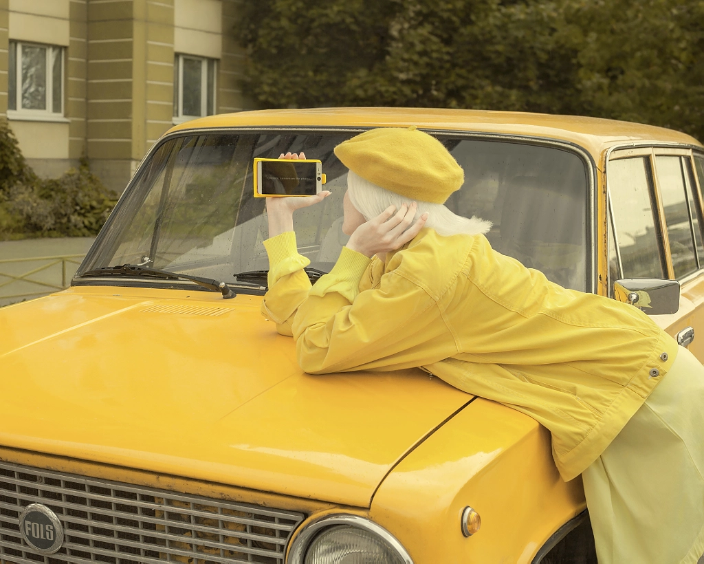
Why it works: This photo was a risk, and it paid off. We see lots of photos created around the concept of technology and “selfie” culture, but this one is memorable because it’s different. Every detail, from the color of the model’s hair down to the make of the car, is unexpected.
The Saint Petersburg-based photographer Renat Renee-Ell goes out of her way to find and scout unusual (often colorful) locations and she selects her wardrobe and props accordingly. “Think locally,” she suggests. “If there is something in your area that you can’t find anywhere else, use it. People react to unique images.”
At the same time, the photo has universal appeal. It isn’t so out of the box that it’s hard to understand. Anyone can relate to this picture. It’s also visually appealing. The monochrome color palette and minimalistic composition make all those fun and quirky details easy to digest.
Renat isn’t interested in chasing trends; she prefers starting her own. “There is no manual for creating masterpieces,” she explains. “You can try to find photography ‘hacks,’ and you can describe useful techniques, but in the end, it is all about having that flair.” Spend some time thinking about what makes you different, and explore that.


